Introduction #
Thank you for support our work, Beagle is an HTML/CSS/JS admin template based on the famous Bootstrap framework, made it with love in every pixel.
In this document you will find a complete guide which covers topics about the product functionality, components, structure, workflow and the initial setup.
Folder Structure #
Once you've downloaded this product, extract the zip file and you will find these directories:
beagle
├── dist
├──── html
├──── starter
├── src
├── dep-copy.json
├── package.json
└── README.md
dist
This folder contains the final production-ready compiled files
html
This folder contains the complete distribution version with all demo content included as seen in the live preview version.
starter
This folder contains the essentials components, this version does not include any of the live preview examples. This is especially designed to get started with only the needed elements.
src
In this folder you'll find the template's source code, if you want to customize the template to fit your specific needs, this is the right place to start with.
dep-copy.json
In this file you'll find the libraries that are copied from "node_modules" to "src/assets/lib". If you want add a new libraries, this file is necessary.
package.json
This is the npm manifest file in which we define what are going to be our workflow dependencies and our main tasks.
HTML Structure #
The template main structure is divided in four sections: Top bar, Left sidebar, Right sidebar and Main content.
<!DOCTYPE html>
<html lang="en">
  <body>
    <div class="be-wrapper">
      <nav class="navbar navbar-expand fixed-top be-top-header">
        <!-- Top bar -->
      </nav>
      <div class="be-left-sidebar">
        <!-- Left sidebar -->
      </div>
      <div class="be-content">
        <!-- Main Content -->
      </div>
      <nav class="be-right-sidebar">
        <!-- Right sidebar -->
      </nav>
    </div>
  </body>
</html>
Required Dependencies #
This template require four libraries to work:
- jQuery 1.9.1 (or later)
- Bootstrap 4.1.2
- Perfect Scrollbar 1.4.0
- Material Design Iconic Font (latest)
In addition to these libs, the main structure needs a basic modular js core to provide the template interaction like sidebars functionality. This file is located in "assets/js/app.js"
There are some dependencies embedded in the app.js file that adds extra functionality to the template:
- Fast Click 1.0.3
- Tiny Color 1.2.1
- jQuery Touch Swipe 1.6.12
- jQuery Bootstrap 4 Breakpoint Check 1.0.5
Include the dependencies #
Be sure to include the essentials scripts in your pages, for example inside your head tag should be like this:
<link rel="stylesheet" type="text/css" href="assets/lib/material-design-icons/css/material-design-iconic-font.min.css">
<link rel="stylesheet" type="text/css" href="assets/lib/perfect-scrollbar/css/perfect-scrollbar.css">
<link rel="stylesheet" href="assets/css/app.css" type="text/css">
And just before the body tag ends, please add these JavaScript libs:
<script src="assets/lib/jquery/jquery.min.js" type="text/javascript"></script>
<script src="assets/lib/perfect-scrollbar/js/perfect-scrollbar.min.js" type="text/javascript"></script>
<script src="assets/lib/bootstrap/dist/js/bootstrap.bundle.min.js" type="text/javascript"></script>
<script src="assets/js/app.js" type="text/javascript"></script>

<script type="text/javascript">
  $(document).ready(function(){
    //initialize the javascript
    App.init();
  });
</script>
Top bar #
We are extending the Bootstrap Navbar component using the fixed version by default, we also added some custom elements:
<nav class="navbar navbar-expand fixed-top be-top-header">
  <div class="container-fluid">

    <!-- Navbar Header -->
    <div class="be-navbar-header">

      <!-- Brand Logo -->
      <a href="#" class="navbar-brand"></a>
    </div>

    <!-- Main topbar elements -->
    <div class="be-right-navbar">
      <ul class="nav navbar-nav be-user-nav">
        <!-- User Menu -->
      </ul>

      <!-- Page title -->
      <div class="page-title"><span>Dashboard</span></div>

      <ul class="nav navbar-nav be-icons-nav">
        <!-- Icons Menu -->
      </ul>
    </div>

    <!-- Left navbar (Used only when there is no left sidebar) -->
    <a href="#" data-toggle="collapse" data-target="#be-navbar-collapse" class="be-toggle-top-header-menu collapsed">No Sidebar Left</a>
    <div id="be-navbar-collapse" class="navbar-collapse collapse">
      <!-- Default bootstrap navbar -->
    </div>

  </div>
</nav>
Navbar Header
In this element you'll find the app logo, located in the top left corner ("navbar-brand"), it will be shown on large devices and hidden on small resolutions: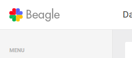
Main topbar elements
Is composed by a group of elements which one of them is going to be hidden("page-title") on small devices.
Desktop View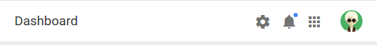
Small View
JavaScript #
In every page, we are calling an object method which handles the basic template interaction. It's written with "The Module Pattern" which encapsulates certain code, allowing to be used when it's needed.
We use a global javascript object called "App", it provides a modular structure that we use to initialize the demo Js plugins on each demo page. You can find several modules in "assets/js" inside the html folder.
Said that you'll notice that there are different Js modules for some of the demo pages, all of them are optional, exept the "app.js" or "app.min.js" in case you want to use the minified version.
init() Method #
This method is responsible for some of the bootstrap plugins initializing, both sidebars functionality and other responsive tasks. That's why this is the core method of this template.
You can add it at the end of the page like this:
<script type="text/javascript">
  $(document).ready(function(){
    App.init();
  });
</script>
Demo modules & methods #
In order to call the following methods you'll need to include the script reference of the JavaScript file, after that you can call it after the init method this way: App.methodName();
Each of these modules contain the JS init for the demo plugins, feel free to copy and modify according to your needs.
| File Name | Method | Page |
|---|---|---|
| app-dashboard.js | dashboard | index.html |
| app-ui-notifications.js | uiNotifications | ui-notifications.html |
| app-ui-nestable-lists.js | uiNestableLists | ui-nestable-lists.html |
| app-charts.js | charts | charts.html |
| app-charts-morris.js | chartsMorris | charts-morris.html |
| app-charts-sparkline.js | chartsSparklines | charts-sparkline.html |
| app-form-elements.js | formElements | form-elements.html |
| app-form-wizard.js | wizard | form-wizard.html |
| app-form-masks.js | masks | form-masks.html |
| app-form-wysiwyg.js | textEditors | form-wysiwyg.html |
| app-icons.js | IconsFilter | ui-icons.html |
| app-mail-inbox.js | mailInbox | email-inbox.html |
| app-mail-compose.js | mailCompose | email-compose.html |
| app-tables-datatables.js | dataTables | tables-datatables.html |
| app-pages-profile.js | pageProfile | pages-profile.html |
| app-pages-calendar.js | pageCalendar | pages-calendar.html |
| app-pages-gallery.js | pageGallery | pages-gallery.html |
| app-maps-google.js | mapsGoogle | maps-google.html |
| app-maps-vector.js | mapsVector | maps-vector.html |
Create an App module #
You can extend the App modular structure easily by creating your own modules like this:
var App = (function () {

  App.moduleName = function( ){
    'use strict'

    //Js Code

  };

  return App;
})(App || {});
Getting Started #
There are three different ways to use this template in your next project:
- Basic Setup
- Using SASS files
- Using NPM scripts
Basic Setup #
This is the quickest way to setup the template, you just have to copy the "starter" folder content into your project root folder and start working on the index.html file.
Be sure to include the essentials scripts in your document to get things work properly. After that you're ready to start building.
Cons
This method is perfect if you think you are not going to make several changes to the original version and use it "as is", otherwise we suggest to use one of the following methods.
NPM scripts #
The NPM scripts are a property of the package.json file, which allows us to define commands that will be executed several times in our workflow. We can create commands to execute tasks or operations like install, compile, minify, remove, distribute, etc., all without having to depend of a task runner.
If you haven't used NPM scrips before, be sure to check out the npm-scripts documentation.
Supposing that you already are familiar with NPM scrips, we are going to explain step by step how to get started with the built-in workflow.
Install Node #
If you already have Node.js installed you can skip this step.
- Be sure to have the latest version of Node.js installed & running in your computer. We are going to use npm that comes with Node.js installation.
Install npm dependencies #
In your root folder enter the following command to install the project dependencies: npm install, this command will install all the template libraries inside the source folder: src/assets/libs, you need to run this command before you run npm run dist in order to include dependencies in distribution.
Setup SASS development environment #
In case you don't know nothing about css pre-processors, this is a brief description about what it is:
SASS is the most mature, stable, and powerful professional grade CSS extension language in the world.
In other words with css-preprocessors you can change the full color theme of this template by just changing a few lines of code.
Setting up your css file #
- In the sass folder
src/sass/you'll find a file calledapp.scss. - Rename it to a different name, for example
app.scss=>beagle.scss. - Then create a new file called
app.scsswhich you are going to use it to modify variables and create your custom code. -
After that, you'll need to include the original main SASS file into the new file like this:
app.scss// Overwrite templates variables here // Import the template source code @import "beagle"; // Your custom code goes here
Inside this file you can modify the bootstrap and template variables values for example to change the color scheme:
app.scss// Modify template colors $primary: #595BD4; $danger: #FD3D39; $warning: #FFCB2F; $success: #53D86A; // Import the template source code @import "beagle";
Variables #
The template comes with several veriables that you can use to customize and create your own version, alongside with the Bootstrap default variables.
To see what variables are available go to "src/sass/config/_beagle-variables.scss".
Available Commands #
After install dependencies now you can run the automated scripts:
NPM Scripts
| Command | Description |
|---|---|
| npm install | Install and copy all the template libraries into src/assets/lib using the dep-copy.json file. |
| npm start | It runs the watch command and an express development server in http://localhost:8080/index.html, this way you can modify your SASS files and it automatically compiles your code. |
| npm run dist | Generate the ready-to-use distribution based on changes made on src directory, the distribution files will be located at dist folder. |
Adding new dependencies #
You can add new dependencies easily using npm, just open your terminal in your root path and install the dependency as usual using npm install dependency-name --save, then you'll need to add a new entry on dep-copy.json file.
Adding a new entry on dep-copy.json file
We use a dep-copy.json file to filter which files do we really want to be copied to our development/production environment reducing the unnecessary load of unused files.
Open the dep-copy.json file and add a new entry like this:
"npm-package-name": {
  "files":{
    "npm-dependency-destination/css" : "npm-dependency-name/css/*",
    "npm-dependency-destination/js" : "bootstrap/js/*"
  }
}
This way the new dependency will be copied from node_modules/npm-dependency-name/ to src/assets/lib/npm-dependency-destination/ and only the files you specified in the new npmcopy entry will be moved to the lib folder.
Globs are enabled for using on dep-copy.json file.
Plugins #
This template comes with four main dependencies, and several plugins for the demo pages, here is the plugin list with the official documentation for each one.
Support #
We are here to assist you, thank you for report any bug/issue to our email support@foxythemes.net.
What support includes?
- Availability to answer questions
- Answering technical questions about item's features
- Assistance with reported bugs and issues
- Help with included 3rd party assets
What support doesn't include:
- Customization services
- Installation services
If you already read the documentation and you still need assistance, please send us your purchase data to support@foxythemes.net and we'll be glad to help you.
Changelog#
| Change |
|---|
| Updated: Bootstrap to v4.4.1 |
| Updated: node-sass to 4.13.1 |
| Updated: Select2 to v4.0.7 |
| Updated: fuelux to v3.17.2 |
| Fixed: Gritter notifications overflow on mobile |
| Fixed: Wrong margin in button inside buttons |
| Fixed: Wrong aside position on collapsible sidebar on Safari |
| Change |
|---|
| Updated: Bootstrap to v4.3.1 |
| Updated: Sweetalert2 to v8.8.7 |
| Added: Footer component in mega menu layout |
| Added: New validation component examples |
| Added: Include BS custom file input plugin |
| Fixed: Sweet alerts and boxed layout bug |
| Fixed: Navbar header wrong width on collapsible sidebar |
| Fixed: Google maps API error |
| Change |
|---|
| Updated: Bootstrap to v4.3.1 |
| Updated: BS breakpoint check |
| Added: Support to top navigation on sidebar layouts |
| Improvement: Improve README file |
| Improvement: Enable form elements outline |
| Improvement: Add support for outline buttons |
| Improvement: Make sidebar bottom input style non dependent |
| Improvement: Support for select2 multiple small size |
| Improvement: Add Bootstrap input file examples |
| Improvement: Make all perfectScrollbars optional |
| Improvement: Add support for text overflow in page title |
| Improvement: Add support for labels in left sidebar main level |
| Improvement: Make alert icon CSS selection more specific |
| Improvement: Add changelog in readme file |
| Fixed: Scroller error on collapsible sidebar |
| Fixed: iOS overflow scrolling unexpected behavior in main content |
| Fixed: Custom checkboxes not working on iOS |
| Fixed: Connections dropdown stop propagation issue |
| Fixed: Code editor indentation |
| Fixed: Deprecated @elseif SASS statements |
| Fixed: Custom file input style is broken |
| Fixed: Wrong disabled style on custom checkboxes |
| Fixed: Email search input icon not vertically centered |
| Fixed: Add preventDefault in left sidebar toggle button |
| Fixed: Main content width overflow |
| Change |
|---|
| Added: Shareable links on documentation page |
| Added: Sweetalerts 2 examples page |
| Added: Responsive datatables plugin |
| Added: Add dragula support |
| Improvement: Enable form elements outline |
| Improvement: Improve H tags style in docs |
| Improvement: Add support for disabling contrast calculation |
| Fixed: Left sidebar JS error on mobile |
| Fixed: Print styles on pages including aside menu |
| Fixed: Broken dropdown menus in mega menu |
| Fixed: Error compiling SASS with a different tool |
| Fixed: Styles on Summernote modal checkbox and file upload |
| Fixed: Documentation page anchor positioning |
| Change |
|---|
| Added: Left sidebar collapsible events |
| Fixed: Missing select dropdown icon |
| Fixed: Perfect scrollbar error on several pages |
| Fixed: Perfect scrollbar is not working on collapsible left sidebar |
| Fixed: Broken links in docs |
| Fixed: Aside structure with collapsible sidebar |
| Fixed: Pages-blank-aside html structure |
| Fixed: Page head position with aside structure |
| Change |
|---|
| Updated: Bootstrap to v4.1.3 |
| Updated: dataTables to v1.10.19 |
| Updated: perfect-scrollbar to v1.4.0 |
| Improvement: Move git repos to npm packages |
| Improvement: Added "active" class in sub-navigation layout |
| Improvement: Create different select2 sizes to match the BS form controls |
| Fixed: Missing hover & active styles to disabled buttons |
| Fixed: form-control-sm doesn't work in select |
| Fixed: Wrong active text color in calendar widget |
| Change |
|---|
| Updated: Bootstrap to v4.1.1 |
| Added: Mega menu option |
| Added: Option to hide logo on collapsible sidebar |
| Added: Tooltip on collapsible left sidebar items |
| Added: New tab styles |
| Added: Option for disabling left sidebar |
| Added: Form title dividers |
| Added: Loading AJAX progress bar |
| Added: Create button group with select2 |
| Improvement: Drop grunt support in favor of npm scripts |
| Improvement: Support for BS4 missing components |
| Improvement: Remove spaces between icons and text |
| Improvement: Improve layout color variables |
| Improvement: Improve color contrast calculation |
| Improvement: Create dataTable filters working example |
| Fixed: Summernote windows scroll up |
| Fixed: Select default style is shown on iPhone |
| Fixed: Misalignment in beagle login template |
| Fixed: Tab icons aren't centered |
| Fixed: Boxed layout is broken on IE11 |
| Fixed: Fixed left sidebar not working on boxed layout |
| Fixed: Search input not working on "no sidebars" layout |
| Fixed: Select2 placeholder is different from the template style |
| Fixed: BS-slider width fix |
| Change |
|---|
| Fixed: Error on Chart.js page |
| Improvement: Added chart tooltips |
| Added: Boxed layout |
| Change |
|---|
| Fixed: Left sidebar menu not showing on mobile |
| Fixed: White corners on modals |
| Fixed: Differences between LESS & SASS source code |
| Improvement: Rename 'light' directory by 'starter' |
| Improvement: Change the logo |
| Updated: Bootstrap to v4.0.0 |
| Change |
|---|
| Fixed: Improve print stylesheet for invoice page |
| Fixed: Select2 arrow position when allowClear is enabled |
| Fixed: Remove box-shadow in btn-link |
| Fixed: Gallery hover container not centered |
| Fixed: Missing hover style on disabled wizard tab |
| Fixed: Nifty modal closes when clicking on itself |
| Fixed: Wrong modals width on small devices |
| Fixed: Modal custom width not working |
| Updated: Fullcalendar to v3.8.0 |
| Updated: grunt-sass to v2.0.0 |
| Added: Support for Bootstrap 4 (v4.0.0-beta.2) |
| Change |
|---|
| Added: Sub navigation layout |
| Added: Loaders page |
| Added: Code editor page |
| Added: Booking page |
| Added: Table filters page |
| Added: Add dropdown menus panel icon |
| Added: Support for SASS |
| Fixed: Text overflow ellipsis in collapsed sidebar |
| Change |
|---|
| Fixed: Wrong position in date range picker caret |
| Fixed: Wrong wizard complete hover color |
| Fixed: Wrong margin left in colllapsible sidebar |
| Fixed: Dropzone upload not working on mobile |
| Change |
|---|
| Added: Collapsible left sidebar support |
| Added: Multilevel support in left sidebar menu |
| Added: Left sidebar perfect scrollbar window resize sync |
| Added: Integrate Multiselect plugin |
| Added: Bootstrap X Editable form |
| Added: Bootstrap date range picker |
| Added: Bootstrap file input |
| Added: Off-canvas menu layout |
| Added: Panel full width style |
| Added: Search input in top header |
| Added: Include development workflow in dist(src) folder |
| Fixed: Missing table-responsive class in responsive table |
| Fixed: Missing horizontal padding in datetime picker |
| Fixed: Fixed left sidebar perfect scrollbar window resize sync |
| Change |
|---|
| Fixed: Open right sidebar on swipe left not working |
| Fixed: Right sidebar toggle button problem on close |
| Change |
|---|
| Added: Option to disable close right sidebar on click outside |
| Added: Timeline page |
| Added: Timeline page version 2 |
| Added: Typography page |
| Added: Invoice page |
| Fixed: Content overflow problem |
| Change |
|---|
| Initial Release |